I love a good rebrand.
Updated & refreshed!
-
Funny & Irreverent
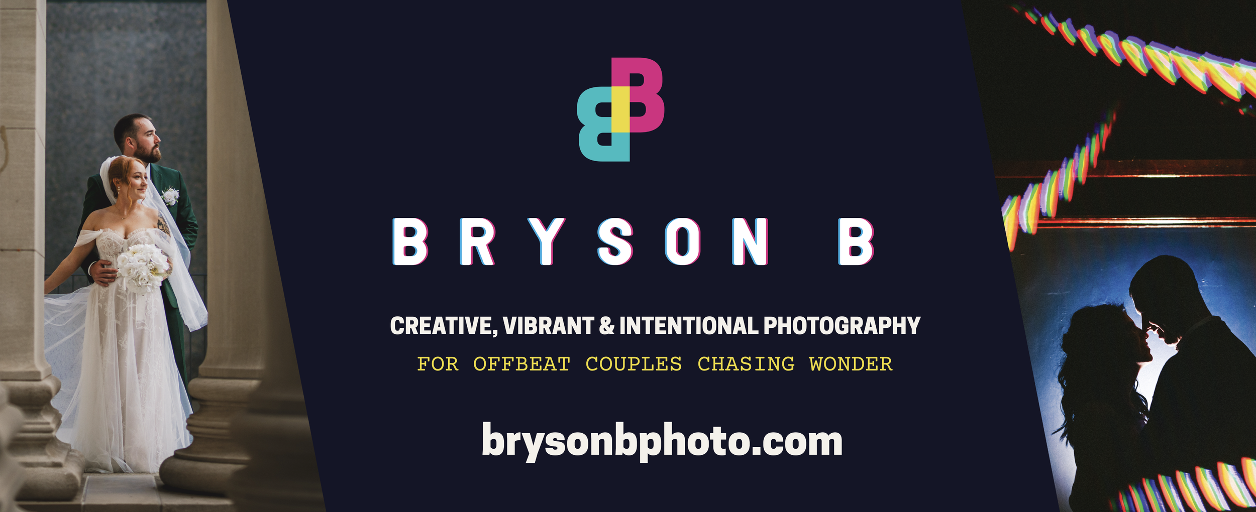
Bryson came to me asking for a whole new refresh to his branding. Something that exudes his personality and reflects the experience you get when working with him.
-
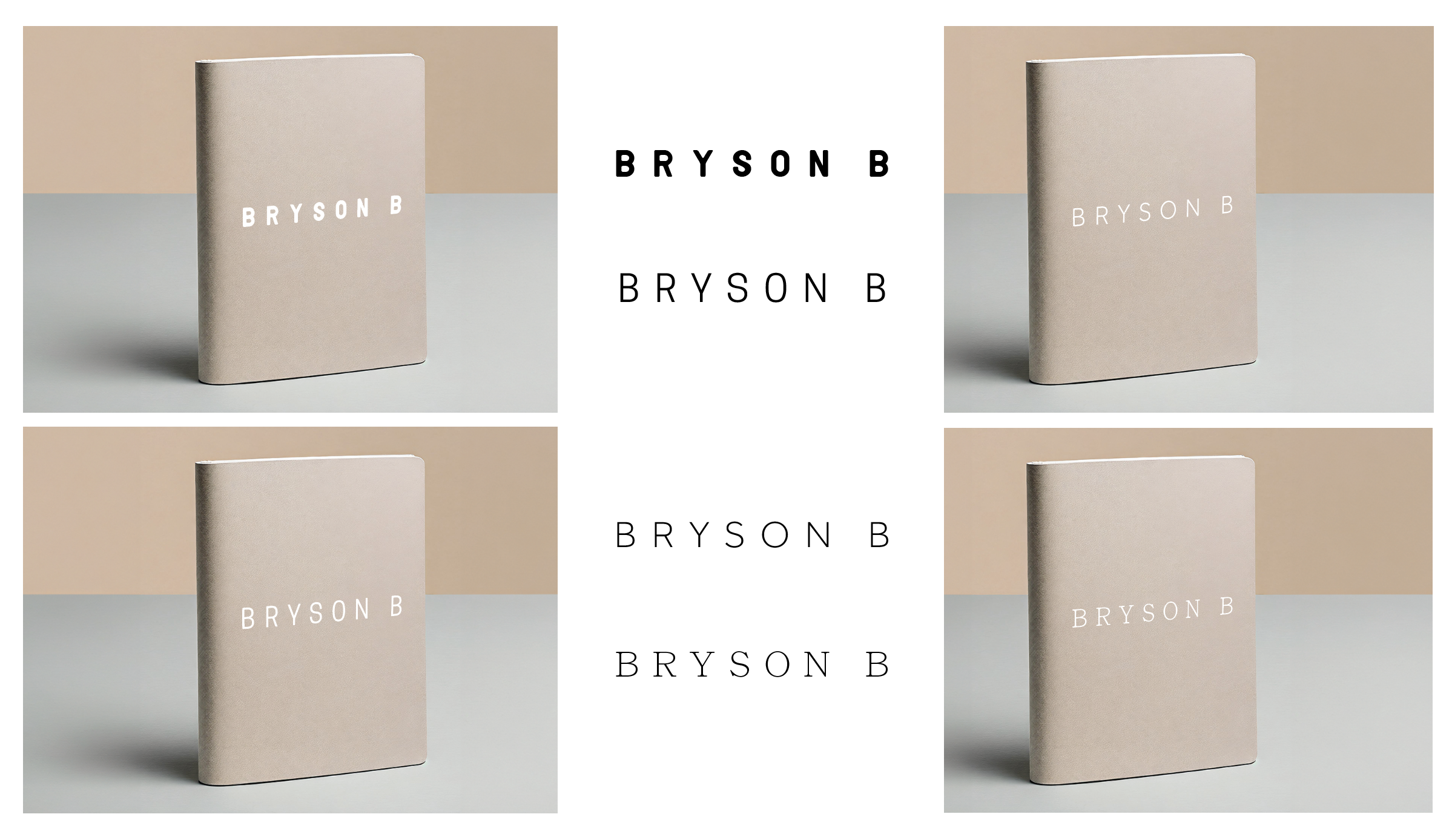
Exploration & Experimentation
We went back and forth thinking about colors, typography, and iconography. Leaning into the chromatic aberration style - we wanted to exude the experimentation that Bryson does in his photography.
-
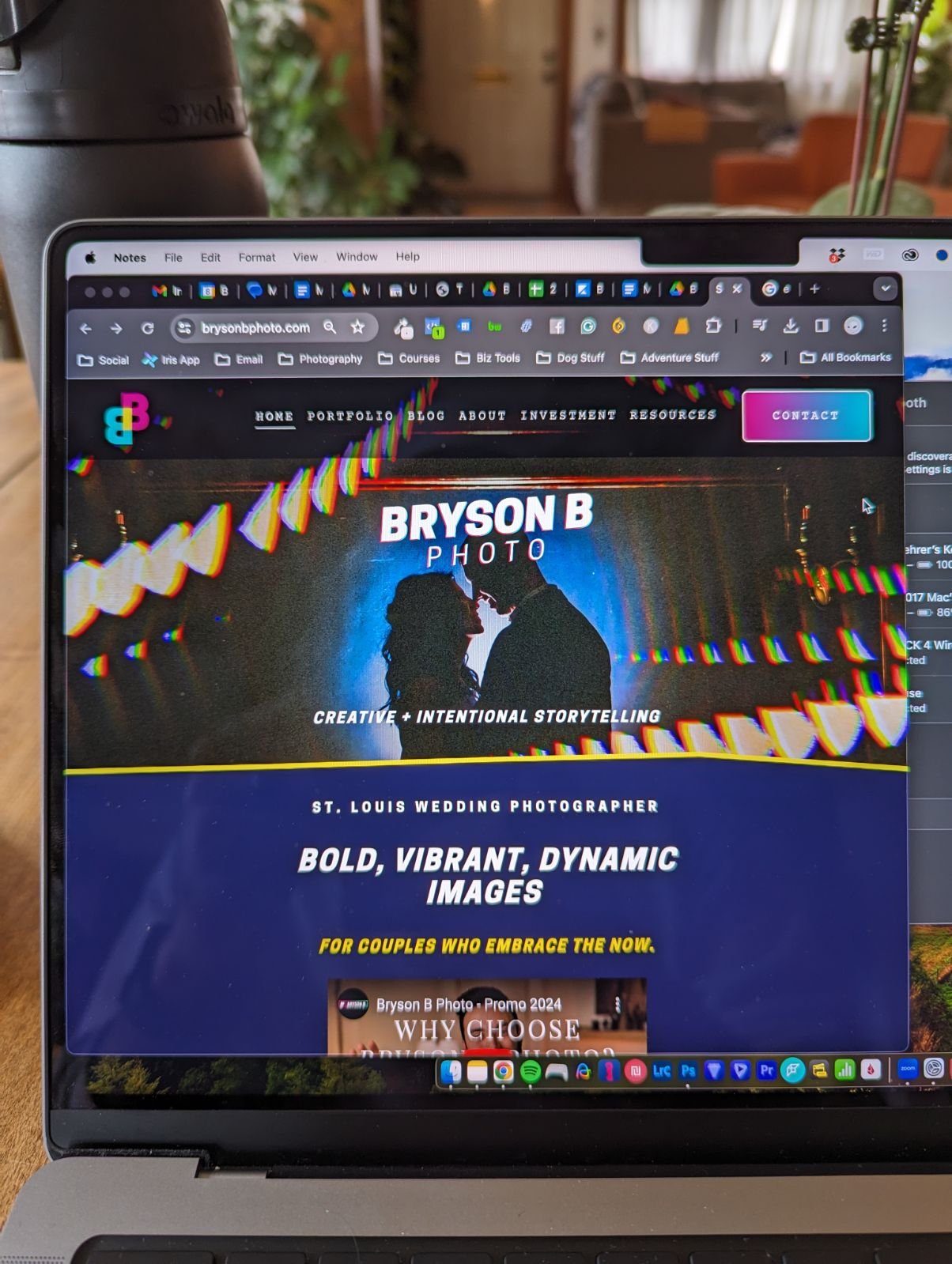
Wrapped up nicely
After we explored the feeling and meaning of his brand, I put together a visual styleguide to represent him. I think Bryson stayed up that night and made his website around the style guide. I love nerds.